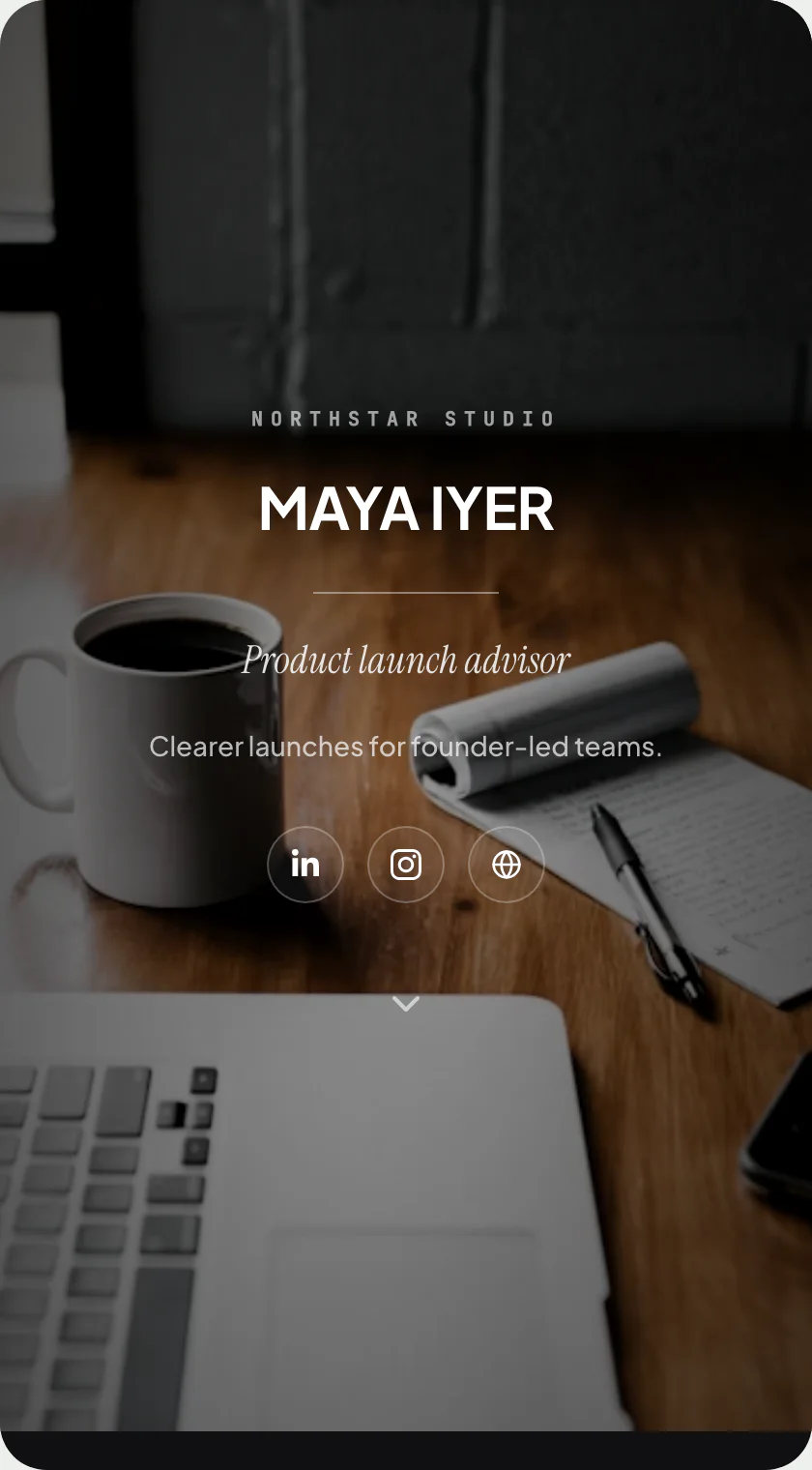
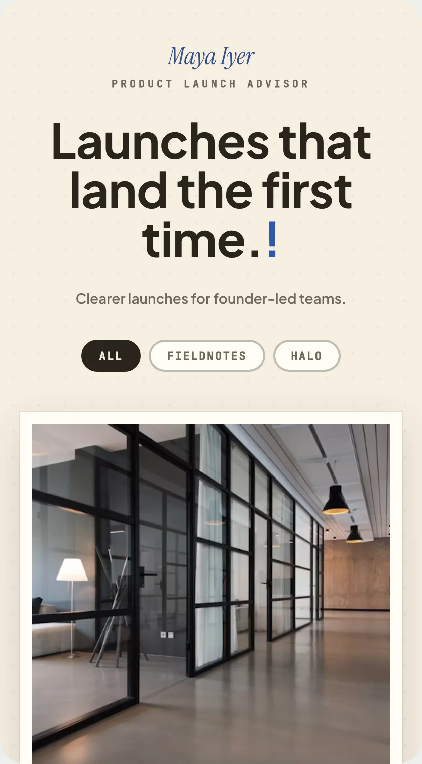
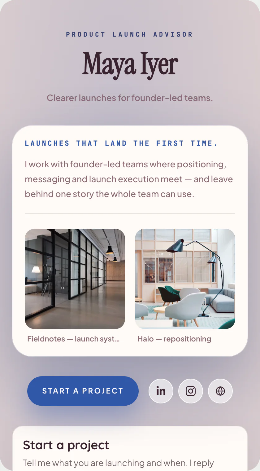
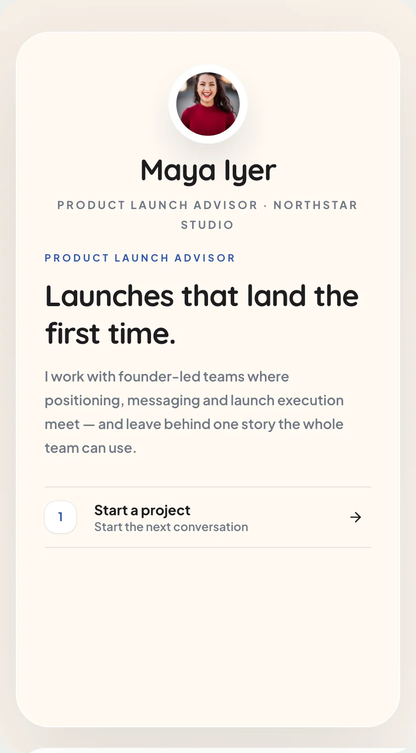
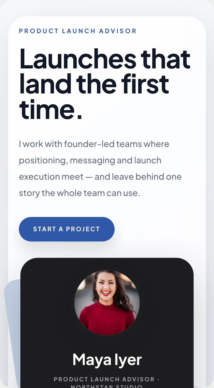
Split Index: the portfolio template that keeps your introduction on screen.
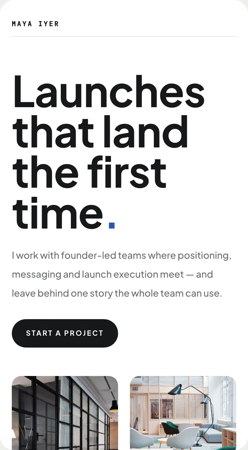
Sticky intro rail beside a clean masonry of selected work.
Sticky rail · one of 17 bio-page layouts · Portfolio / Clean
Free to start · no design skills needed · published at your own link
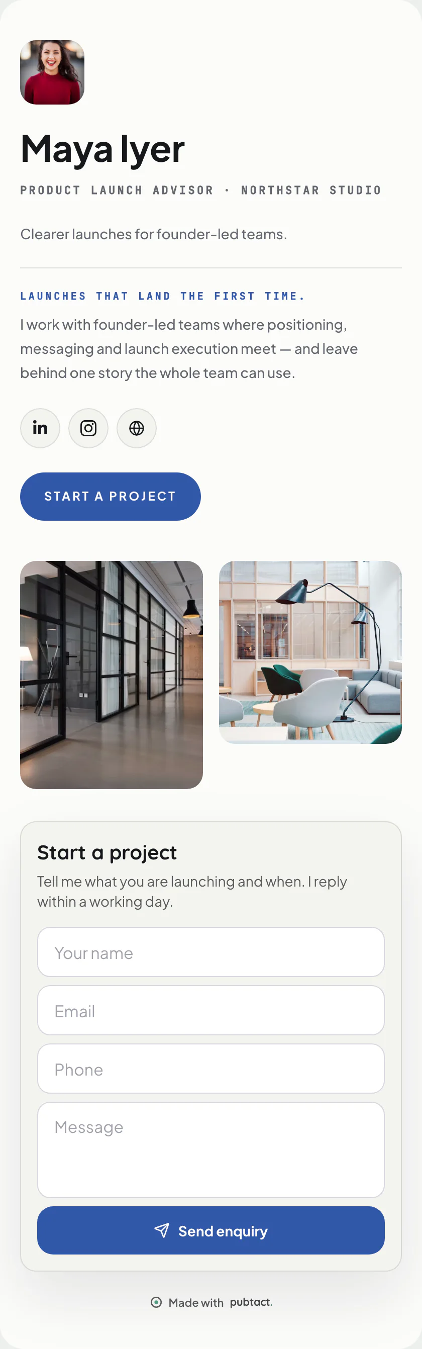
Scroll inside the frame — this is the whole page.
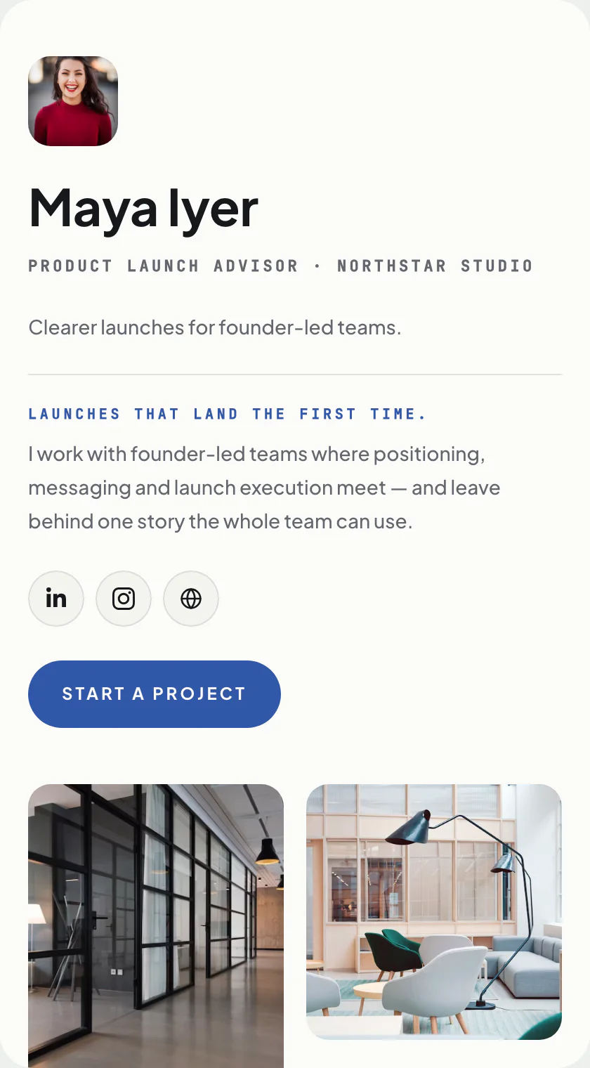
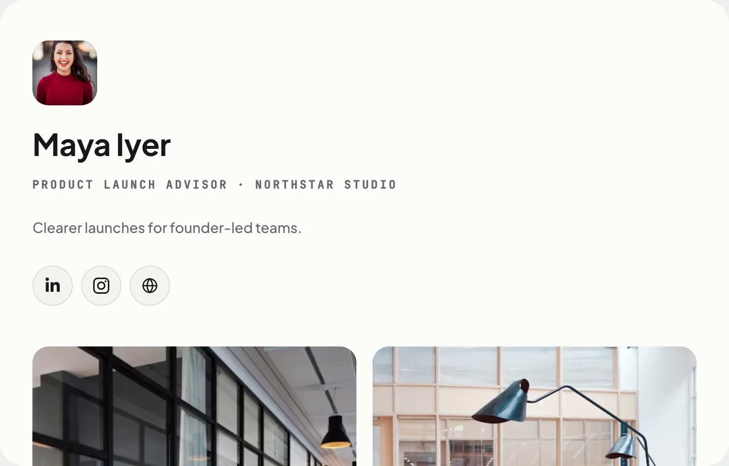
Two views
The same page, on a phone and on a screen.
What goes on it
Everything on Split Index is a piece you can change.
- Your name and faceAdd your photo, name and a one-line introduction.
- A short introA few lines in your own words.
- The one buttonPick the action that matters most: save contact, call, WhatsApp or book.
- Your social profilesAdd the ones you use; hide any of them with a switch.
- Your work in picturesPhotos of work, products, spaces or plates — shown big.
- Kind wordsQuotes and reviews worth showing.
- An enquiry formVisitors leave a name and number; the lead lands with you.
Only the first two are required. Add, remove and drag the rest into your own order — before or after you publish, your address never changes.
How it works
Yours in three steps.
- 01Start from Split Index
Sign up free and pick this layout — it opens in the editor ready to fill in.
- 02Make it yours
Type over the example details. No design decisions — the layout is already made.
- 03Publish and share
Your page goes live at your own handle. Share the link, or let people scan its QR.
Who Split Index suits.
Designers and studios with a real body of work. The sticky rail means a visitor three screens into the grid still knows whose work they are looking at, which is where most portfolios lose people.
What it puts first.
The work, with your name pinned beside it rather than above it. The introduction stays available without ever taking a turn in the scroll. Work first, always. The rail keeps your name in view while a visitor scrolls, which is where most portfolios quietly lose the person reading them.
Where Split Index is the wrong choice.
It needs at least six or seven pieces to look like a portfolio rather than a gap. With three projects, Hello is a stronger page and an honest one.
Before you start
The questions everyone asks.
- Is the Split Index template free?
- Yes. Pick it, add your details and publish at your own handle — building and publishing a page is free.
- Can I switch to another template later?
- Yes. A template is a layout over your content, so you can move to any other about page layout whenever you like — nothing gets retyped and your link never changes.
- Do I need a website or hosting?
- No. Your page is hosted for you at your own handle — nothing to install, nothing to maintain.
- Will it work on a phone?
- Yes. The page is built phone-first and opens in any browser — the people you share it with don't need an app.
Keep reading
If this is not quite it.
Same product